Project Goal
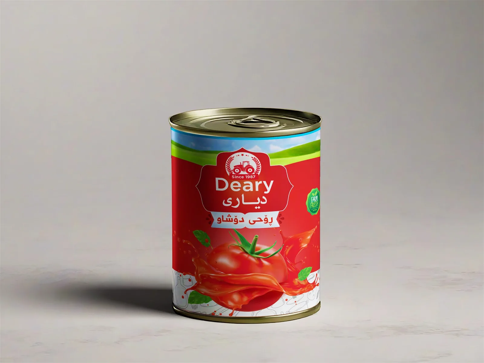
Design a standout tomato paste can for the Deary brand that immediately communicates natural quality and fresh tomato origin. The packaging layout needed to grab attention in a highly competitive market category and ensure readability of key dietary facts.
Design Direction
A bold, appetite-appealing red color scheme was chosen to represent natural vine-ripened tomatoes. Simple, clear typography highlights the brand name and product volume, complemented by high-resolution food photography that highlights fresh ingredients and wholesome taste.
Final Visuals